
Thumbnails That Gets Views
Thumbnails That Gets Views
YouTube thumbnails that are clickable
What’s up guys? Welcome to Upstream Charlie. The best place for content creators, solopreneurs and freelancers.
Now in today’s article I want to talk specifically about YouTube… but specifically… I really wanna zone in on “Thumbnails”.
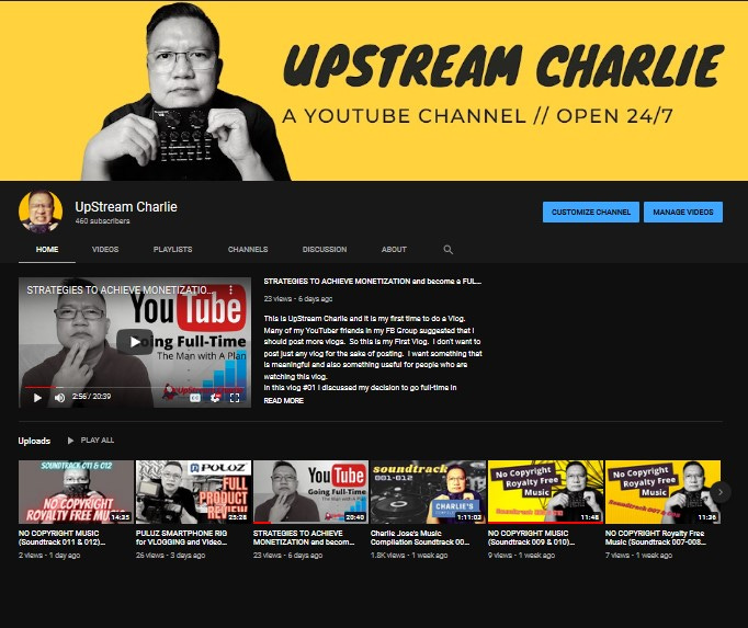
I’ve discussed the importance of thumbnails in my progress Vlog leading up to monetization in my YouTube channel (UpStream Charlie).
But I really don’t have a dedicated video or an article specifically about thumbnails… so here it is.
I’m going to teach you -- the HOWs and WHYs of “clickable” YouTube Thumbnails.
So, in today’s article I’m going to share to you my top 5 guidelines of creating awesome thumbnails that gets noticed and gets views.
And I hope by sharing this guidelines or framework, you will be able to replicate the same results in your YT channel but also in your other social media platforms as well… so you can really maximize those thumbnails and get more views and more likes and (hopefully) more subscribers to your channel.
#1 RULE
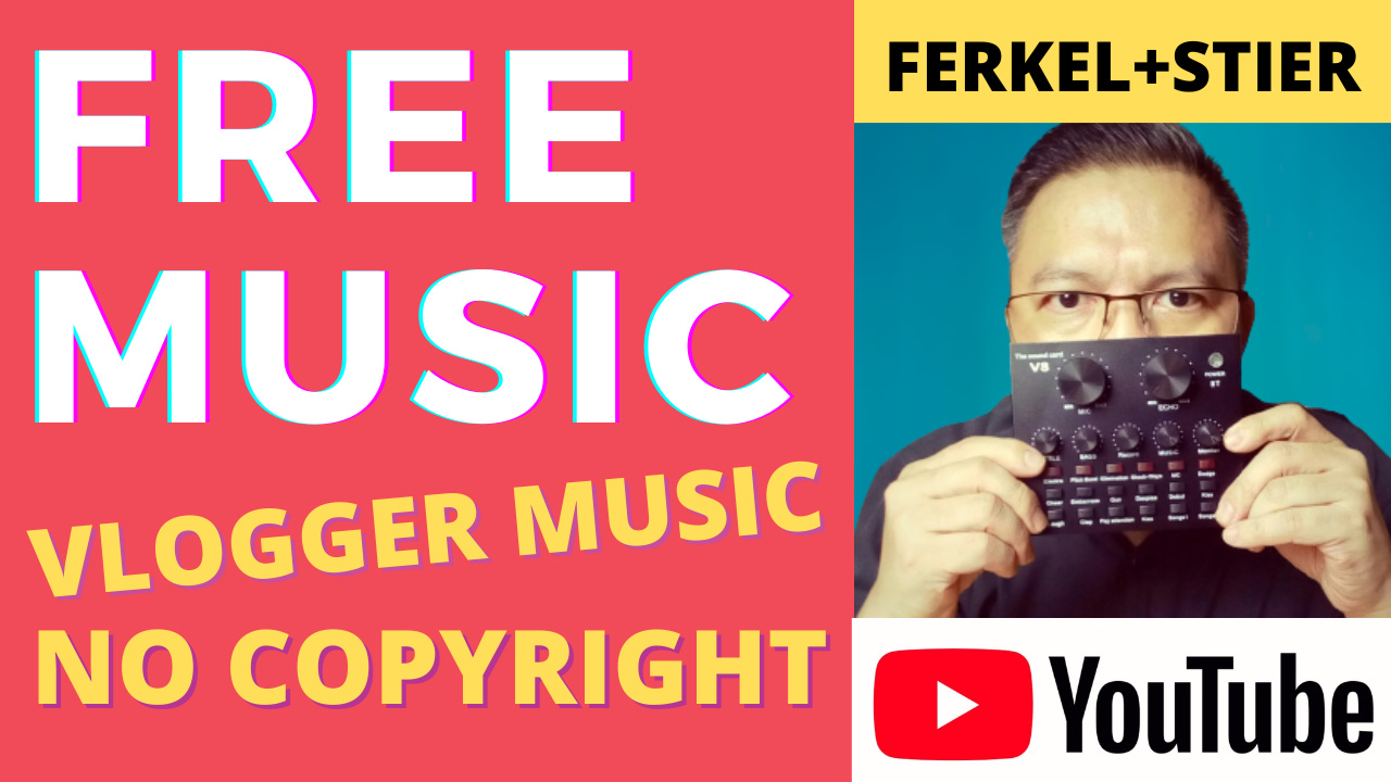
Alright, the first rule is to show your FACE.
Why put your FACE on the thumbnail design?
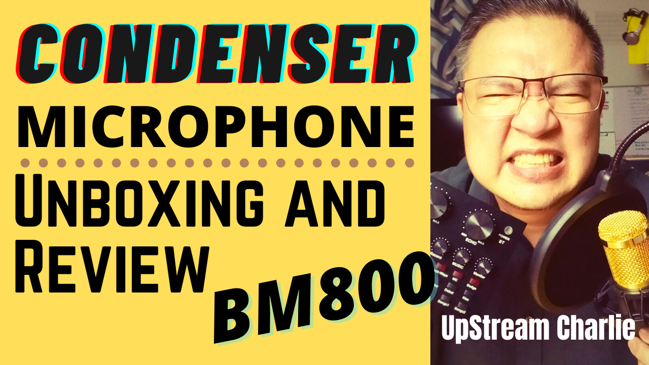
Because putting a Face on a thumbnail gives that human touch… People who are channel surfing over YouTube will most likely connect with a thumbnail with a human face in it…
There is a phrase “A picture paints a thousand words” to indicate that a picture can express a complex idea in the same way a large amount of descriptive text can.
———————————————————————
INTERESTING FACT:
A similar expression to ‘A picture paints a thousand words’ first appeared in a 1911 newspaper article quoting editor Arthur Brisbane’s discussion of journalism and publicity: “Use a picture. It’s worth a thousand words.” During the discussion, Brisbane was making a clear-cut case for the use of images to accompany stories.
———————————————————————-
True and true. It is true back then when print newspaper and magazines were the top dogs in the media world, and it’s all the more true today with social media and with thumbnails and blogs (apparently). I guess Mr. Arthur Brisbane was correct all along.
In social media, we can re-phrase this as “a picture is worth a thousand clicks.”
#2 RULE
The second rule of thumb in making your thumbnails is – SAY NO to FANCY FONTS.
Fancy fonts like all those different types of Scripts fonts that are used in wedding invitation. Fancy fonts like Bodoni or Broadway are well and good but they don’t give you the best visibility on small screens such as mobile or smart phones.

Don’t use fancy fonts not unless it is readable on your smart phone.
Simple readable fonts are always the best and it is more visible on mobile phones.
#3 RULE
The third rule of thumb – keep it SIMPLE.
Your text on the thumbnail should be 4 or less than 4 words.
Why few words, Charlie?

It’s for optimization purposes, most especially (optimized) for mobile or smart phone users.
It’s easier to read with less words but the challenge is how to simplify your title.
That’s where your beautiful mind comes in. I can only do so much in this article.
And don’t cram too many images or text in your thumbnail. Like this sample thumbnail.

The above thumbnail design will not register well on the screen of any smart phone and your thumbnail will just be a spec out of the millions of thumbnails being posted everyday in YouTube. So, keep it simple, always.
#4 RULE
The fourth rule of thumb in making your thumbnails is to keep your TITLEs and TEXTs on the LEFT hand side while your photo is on the right. Like the one below.

Why? Because majority of people in the world reads from left to right. It’s basic psychology. Not unless you live in China where they read right to left and top to bottom if they use traditional Chinese writing and I guess it’s the same with people from Japan.
Plus there are stuff on the right side from YouTube like the timer that’s cramping up everyone’s style. I do wish the smart people of YouTube would do something about this in the future.
# 5 RULE
The fifth rule of thumb is BIGGER is BETTER.
A lot of people use mobile phone to surf the internet and do social media. In fact, in the last market research, mobile phones or smart phones are the number one device used to surf the Internet and do social media.
You also have to consider the size of the mobile phone. Because if you do it right with the mobile phone, you’re gonna be all good to all devices – tablets, laptops, desktops, and smart TVs.
Because if you don’t, your thumbnail will look a spec in mobile phones and even sometimes on laptops and desktops so don’t cram everything in.
Like these bad layouts…


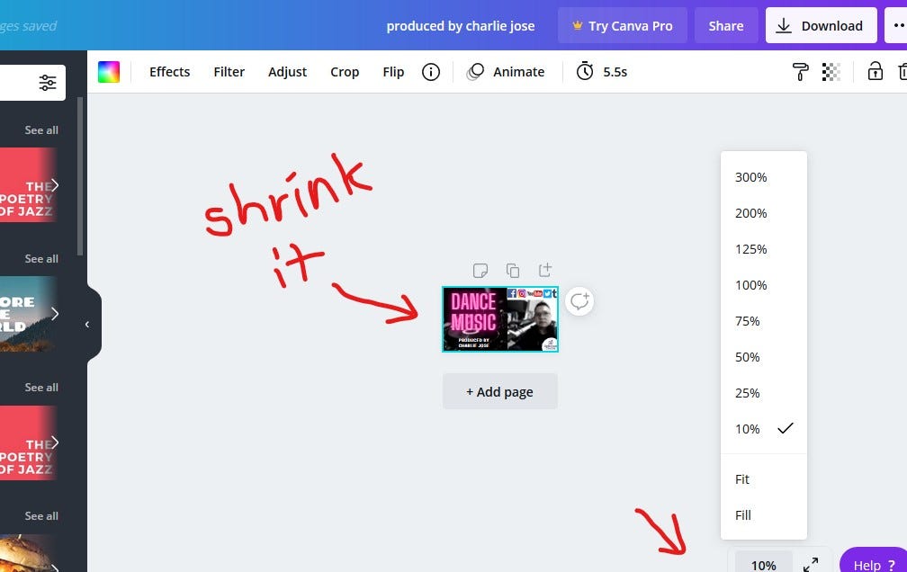
To test whether your design is good enough for mobile phones, all you have to do is minimize the thumbnail you created in Canva in the views option. Minimize it to a size that is similar to the size you see in mobile phones. Once satisfied, then you can finalize your thumbnail artwork and download it.
By the way, you can use other apps to do your thumbnails, it’s just that I use Canva a lot. I leave it up to you. If you want to do it on Photoshop or similar apps, then just do it, as long as you know the standard thumbnail size for YouTube.
So, there you go. My FIVE guidelines in creating and developing thumbnail designs for YouTube. I really do hope you learned something today.
While you are waiting for my next week’s video. Check out my other videos that may peak your interest in my YouTube channel.
Again, this is Charlie Jose and you’ve read the first article of UpStream Charlie here on Substack. Ciao, bella!
—————-
Click the link below, if you want to use Canva like I do.
And here’s my YouTube channel, you can click on that, too.